Fabric Painting for Embroidery Project
|
||
|
This project will be done in several parts. I will
start with the simplest fabric painting to use for embroidery and
the future parts will be more complex as you get accustomed to the
method. If you haven't done so already, download the Supply List
below and assemble all the tools and materials. |
||
Download Supply List |
||
| This Fabric Painting Project
is only for utilizing acrylic paints and will not address the more
advanced methods of Fabric Painting. The main objective of this project
is to produce fabric that you can then use for quilting/and or machine
embroidery. We are going to be producing backgrounds - not detailed
paintings. These go together quickly and are very durable. They do
not hurt the sewing machine when used for embroidery. I have machine
washed many of mine many times and they hold up extremely well as
long as you follow all the steps. |
||
Project One |
||
|
|
|
|
|
Our first project will be to produce a two-tone fabric to be used for the background of an embroidery. Step 1: Choose colors: I usually create my fabric and then find an embroidery to fit, but if you have a special design you would like to plan for, use this for the colors. I get a lot of questions about color. The right colors can make all the difference in any of the projects we do, but color is also very subjective. Here are some things to think about when choosing your colors: What colors are used in the projects I'm attracted to? For example - are they predominantly blue, red, yellow, etc. Are they bright or subdued? Are they dark or light? Do the projects have a lot of contrasting colors or are they more monotone? If you are making a project for another person, what colors do they wear, have in their home, use for their projects, etc. You might adore violet and want to make a violet wall hanging for your best friend, but she thinks it's *old fashioned* and would much rather have red and black. Where am I going to use the project? You want to make sure your project blends well with the existing decor. Blending doesn't necessarily mean matching!!! A sunny wallhanging of mostly golds and yellow might look great in a mostly soft blue room. Find different bits of colored things - paper, fabric, and tack them up where you are going to put your project and STAND BACK and look. The gorgeous pale lavender picture you are planning might look great up close but could get lost in a large room of soft colors. What size is my project going to be? Size can be very important in choosing colors. Your room might be able to handle a huge wall hanging done in soft blues, but that same wall hanging done in vibrant colors could send you running from the room. I'm not saying that small can be bright, and large has to be soft! I am just saying that it's good to get an idea of the effect of your color choices when translated to the size you plan and where you will put the finished product. Experiment! A box of 100 Crayola crayons is a great investment.
Grab some paper and your box of crayons and scribble different colors
together. You don't have to be an artist - you don't even have to
draw anything, just draw shapes or blotches of different colors
next to each other to see how they look For this Project, start with two paints of similar color (Red and pink, dark green and lime green, etc.) and white |
||
|
Step Two: Choose your fabric I have used fabric that is very sheer to fabric that is quite heavy. Heavy fabric allows you to slather on lots of paint and get a very solid, even three dimensional look. Sheer fabric, like muslin, allows the paint to soak through and gives you a much softer look, but it is also more difficult to work with. You can put some paint on it, turn around, and then look back to see your nice shape all spread out. For this project I would choose two or three pieces of fabric of different weight so you can see the effects on both.
Wash your fabric before painting!!! Many fabrics contain sizing that will prevent the paint from setting well. Also, because the finished project can be washed, if the fabric hasn't been preshrunk, it's first wash can have a very detrimental effect on your painting. |
||
|
Step 3:
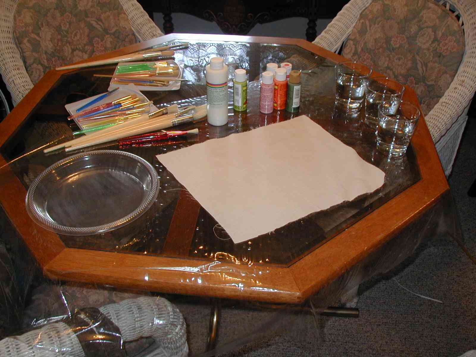
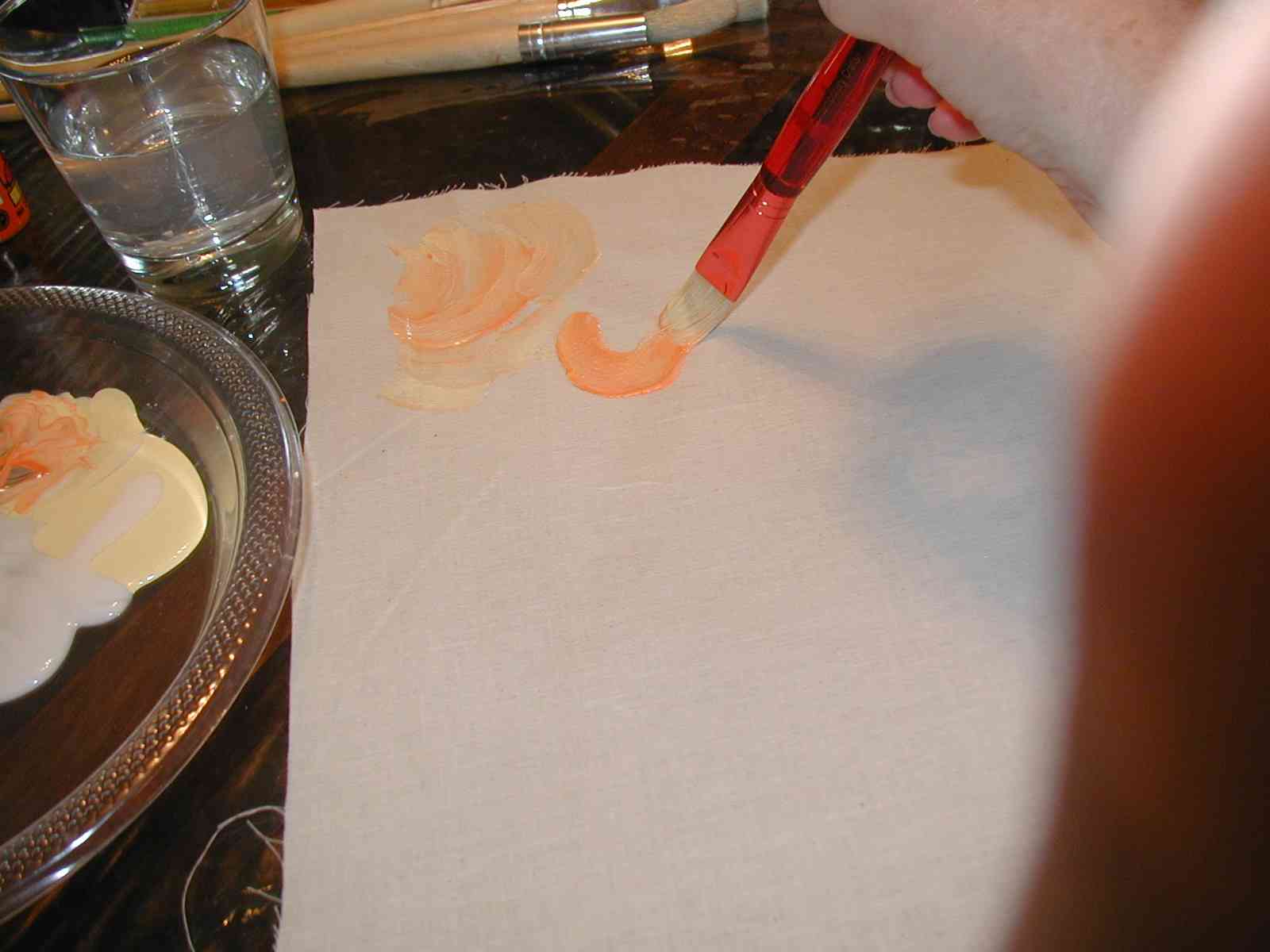
Prepare your fabric and paints Cover your work area with something that will prevent the paint from soaking through to the surface underneath. Plastic tablecloths are good or a piece of vinyl. Make sure your surface is big enough to hold you piece of fabric, your paints, two or three cups of water and your paint *palette* (my favorite palette is a clear plastic plate) I used the same brush for all the examples below - a wide flat one about 1/2" wide.
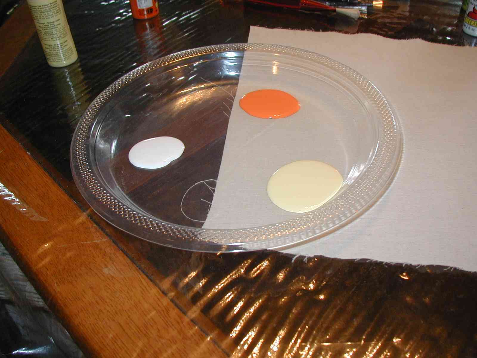
Those of you who are very neat might have a hard time with this next step: Prepare you Palette
|
||
|
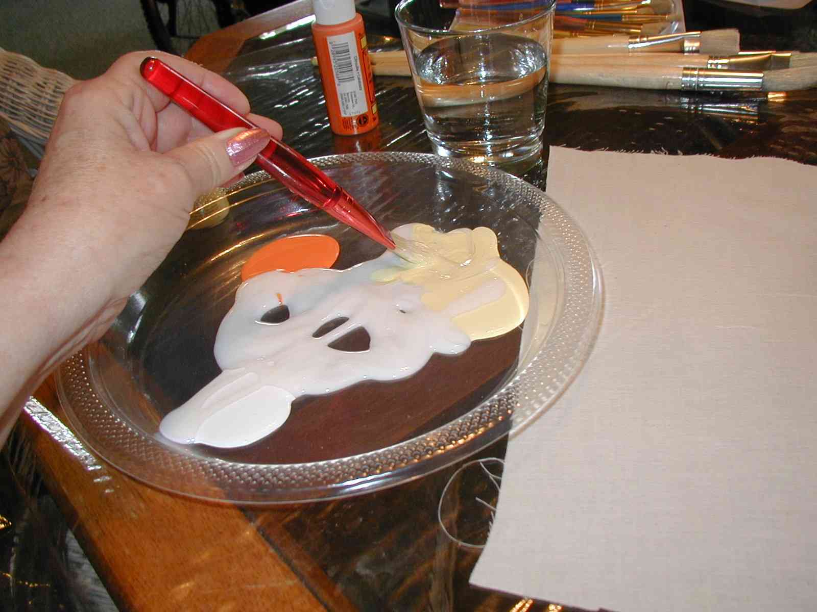
I first squeeze a blob of each of my colors around the edge of my plate. I've chosen orange, yellow and of course the white |
 |
|
| I then squeeze a fairly large amount of medium all over the plate. The amount of medium you use will determine how soft your finished fabric will be. | 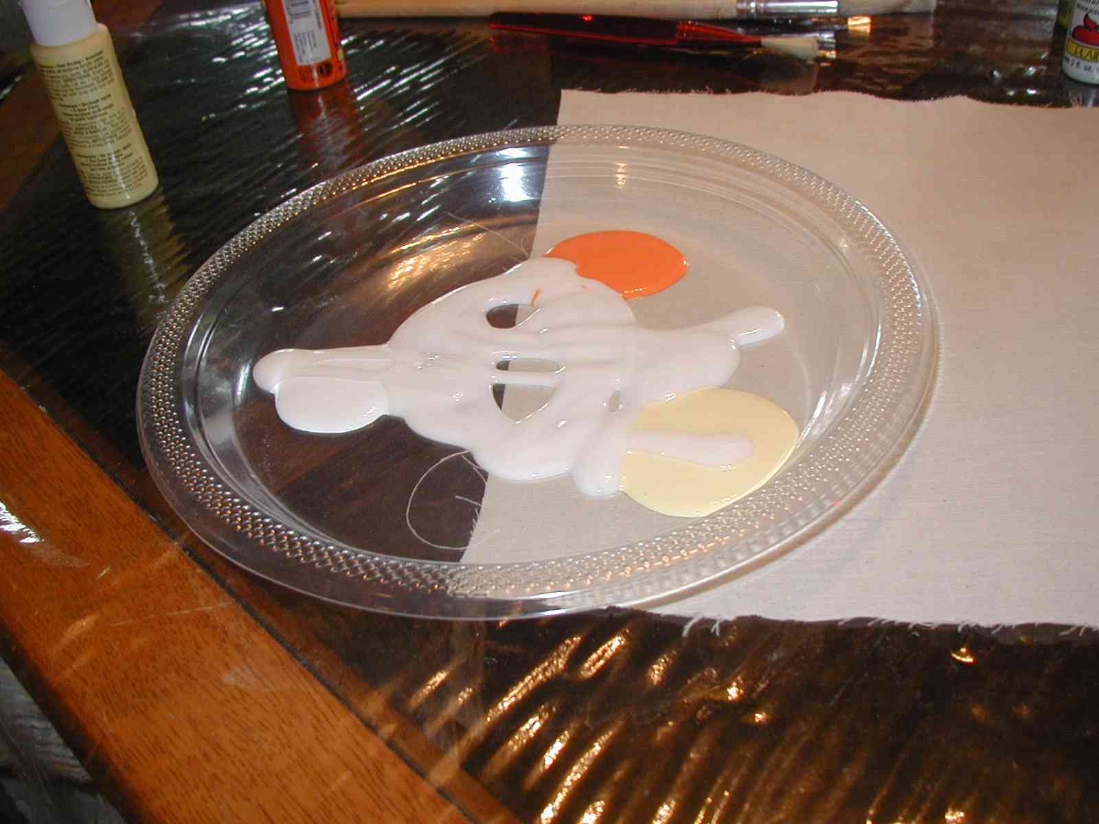 |
|
|
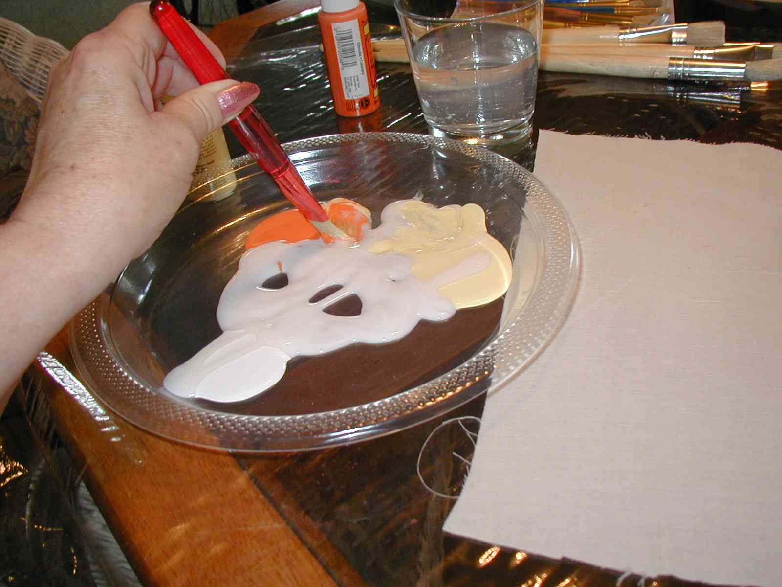
I then mix each of the colors with some of the medium and also add a little water by dipping my brush in the water and then mixing. The only time I have washed my brush out in the following steps is in between paintings. Otherwise just use the water to thin the paint a little. |
|
|
Example One |
||
|
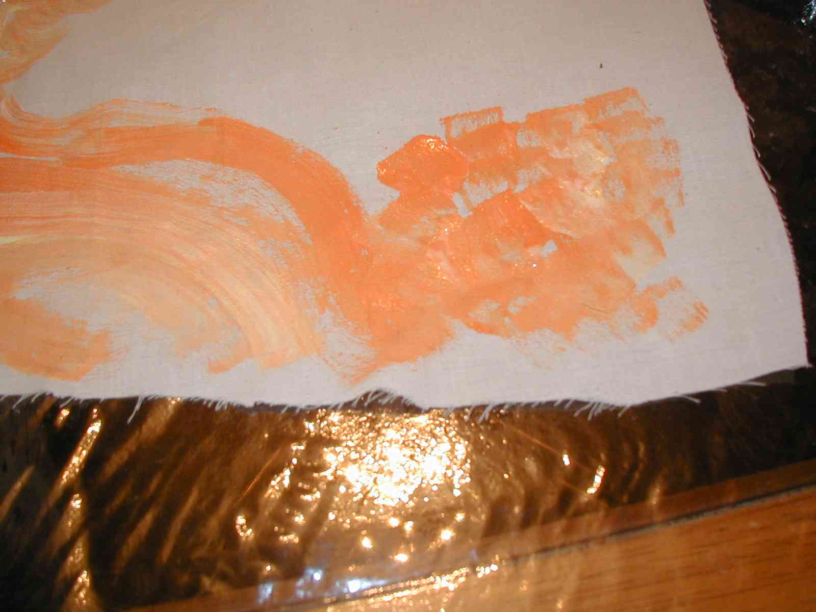
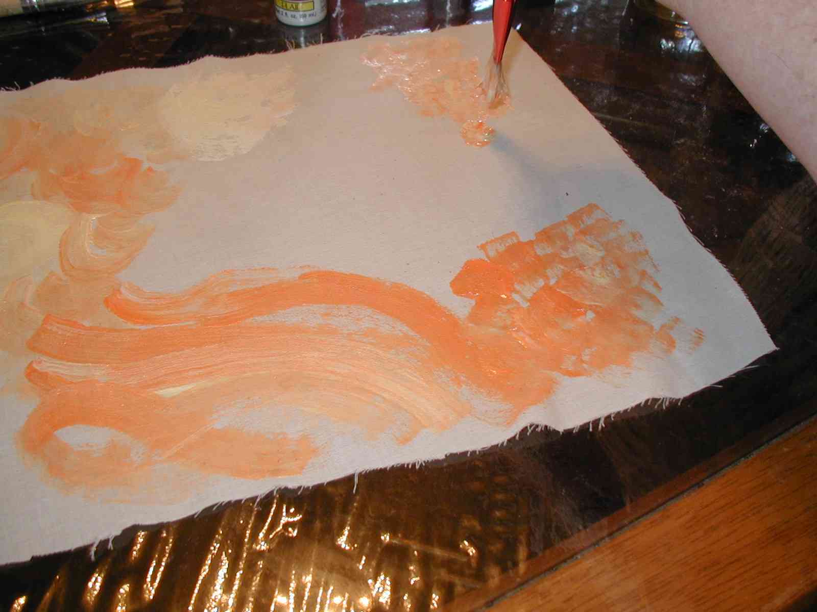
The first method is the *half circle* Load your brush with some of the color - don't try to get just one color, the beauty of this kind of painting comes from having a mix of colors on your brush. Then put your brush to the fabric using a circular motion. Move the brush quickly - you don't want the paint to be *ground* into the fabric - more laid on top. It will soak in by itself. |
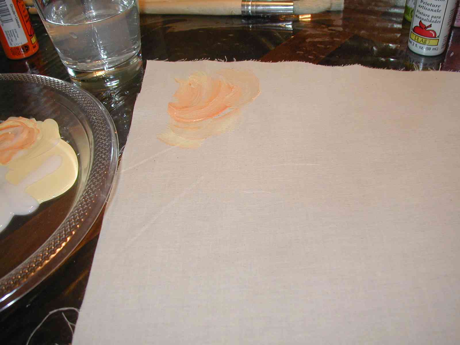 |
 |
| Continue a section of half circles choosing more of one color than the other for some of the *swirls*. If the paint starts looking thick, mix it with the medium and add a little water on your palette. Just add a little water at a time - you don't need much | 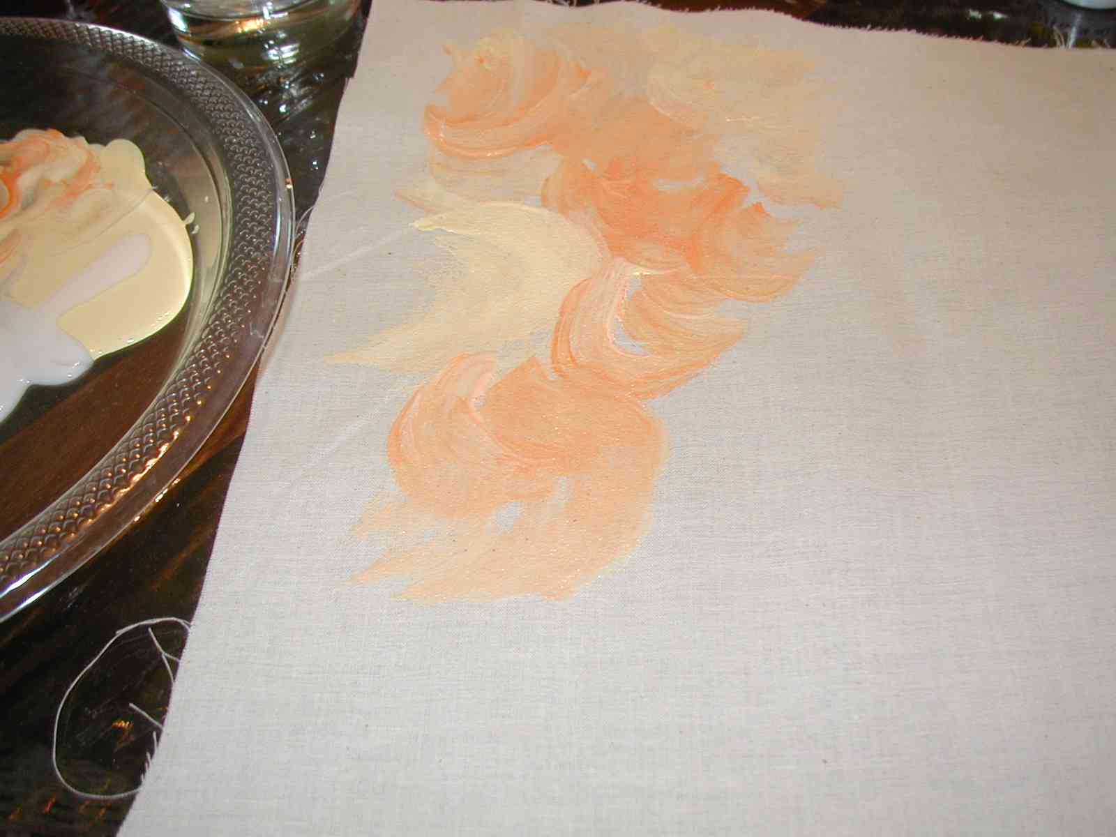 |
 |
| The next method I'll call the *stroke* Load your brush with a good amount of paint and make long streaks across the fabric. Resist the urge to go over a stoke if you not quite sure you like it! If you brush over the same spot more than once or twice, it will start getting washed out. Instead just get more paint and put another stroke overlapping it. | 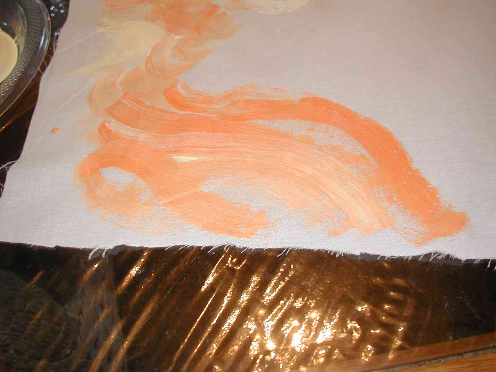 |
|
| The third method is the *dab*. You fill the brush with paint and then holding the brush vertical to the fabric, push down on the fabric in a quick motion and lift immediately - just as if you were dabbing something to get out a stain. This method looks great with bits of two or more colors of paint on your brush not mixed - dab your brush at an angle in one color, reverse the angle and dab the other side, then start dabbing your fabric | 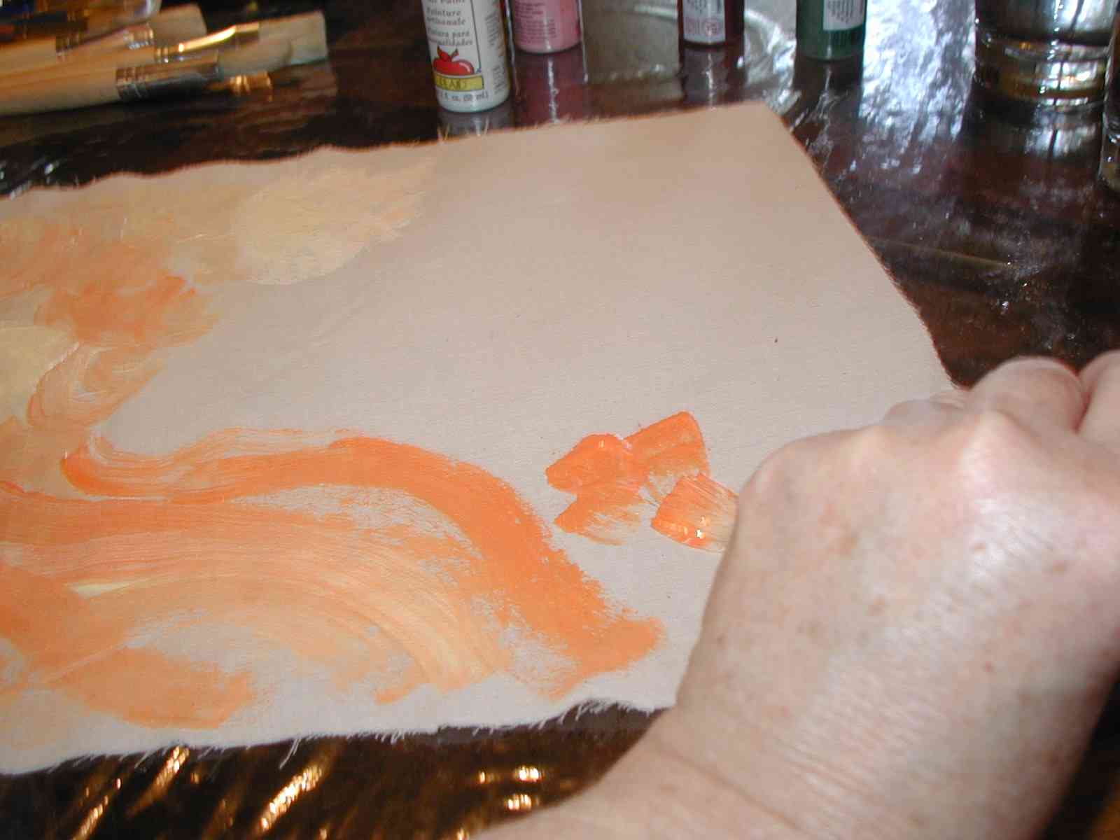 |
 |
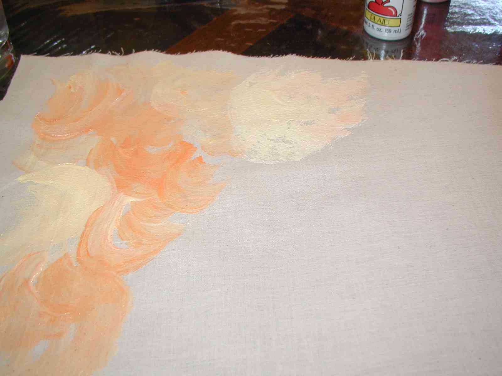
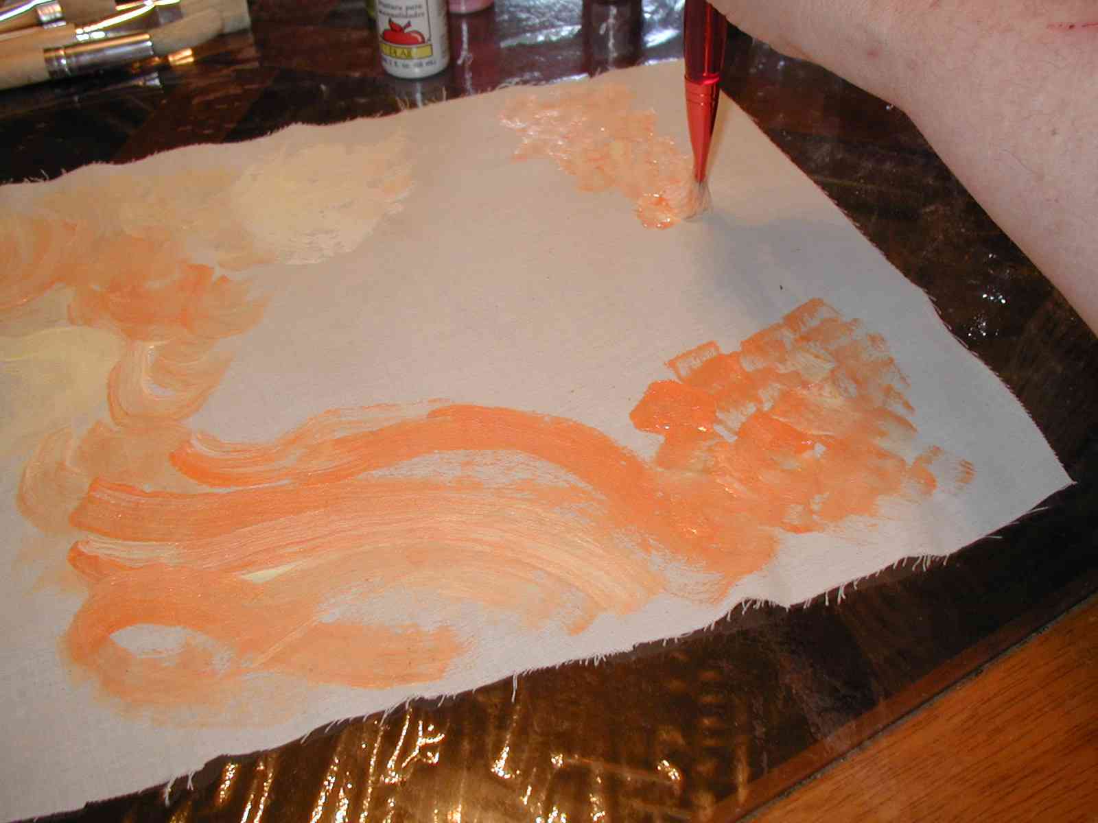
| As you can see, by now my palette has all of the colors blending into one another | 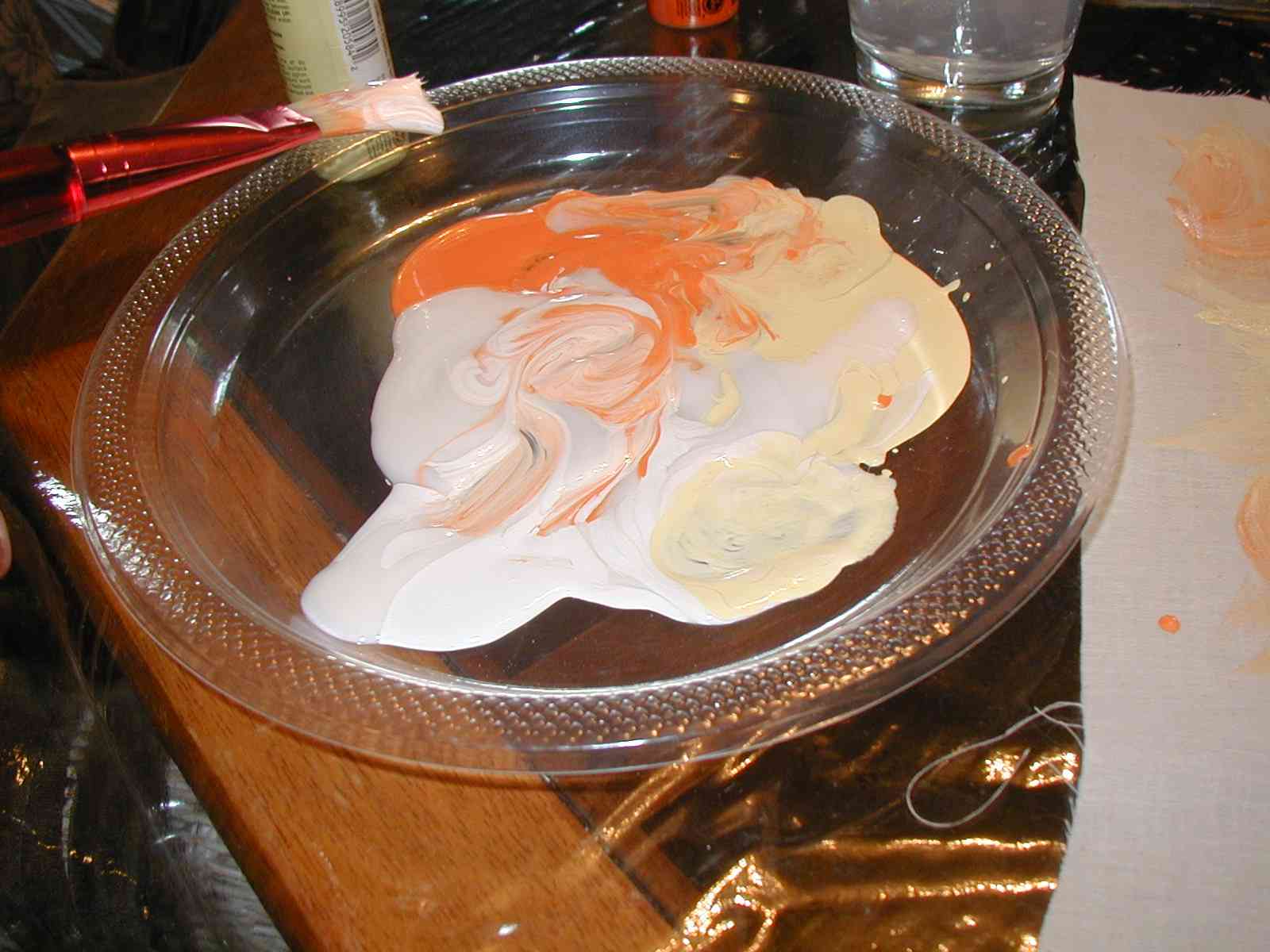 |
|
| More dabs coming down from the corner | 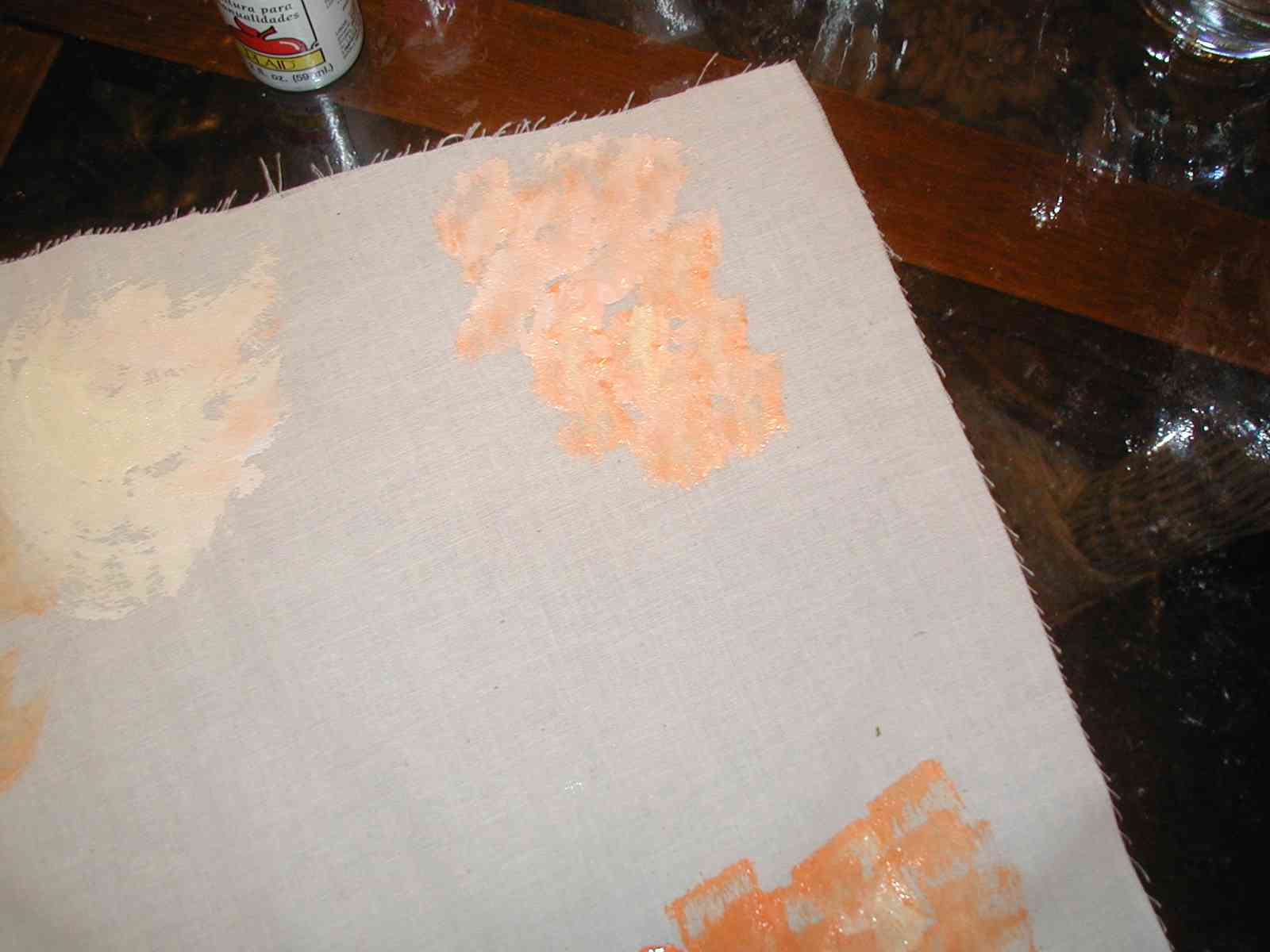 |
 |
|
I've then added more swirls in the middle with a row of darker dabs VERY IMPORTANT: Resist the urge to *over paint* In this kind of painting less is usually better than more. It is OK if the fabric shows through in some places - in fact it should |
 |
 |
| IMPORTANT: Have fun with this!!! There is no right or wrong way to do this. Remember that you are going to use this for embroidery. If there's a spot you really don't like, put a butterfly on it :) | ||
|
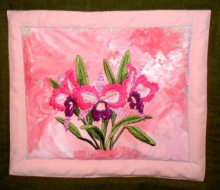
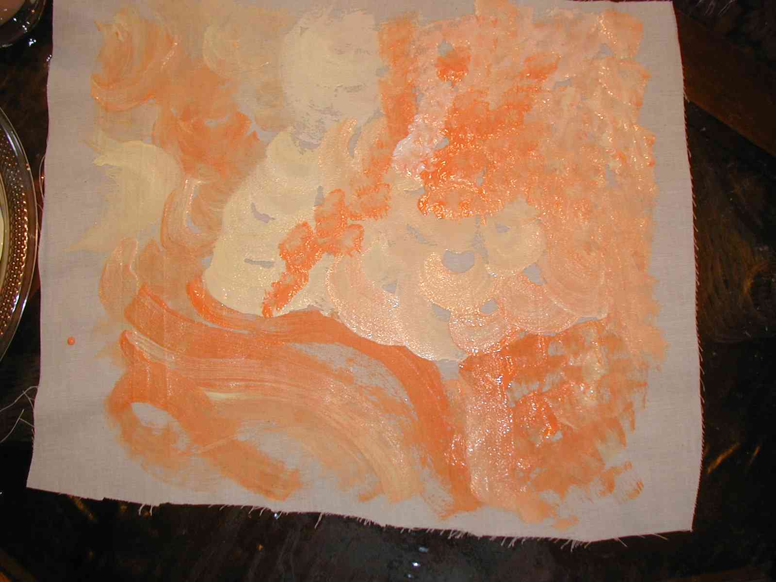
Once you are finished, you need to hang the painting to dry. I like to pin it to a wire coat hanger and hang it in my shower. You need to let it dry for a full 24 hours. I think I might use this one as a background to the cape daisies
in the Oriental flowers collection |
Heat Setting After the painting has dried for 24 hours, it needs heat to permanently set the paint. There are two methods: ironing the fabric for a good 10 minutes or throw it in a hot dryer for 20 minutes. I prefer the dryer method :) Once you have done this, the paint will NOT come off and you can even wash the fabric in the washing machine. |
 |
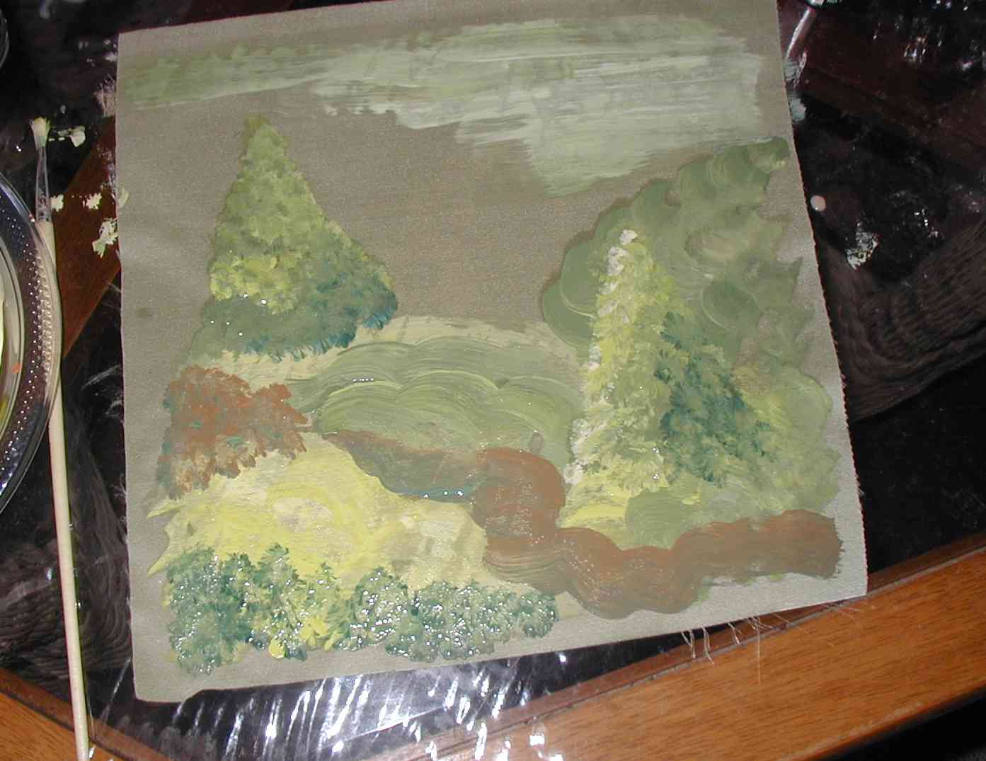
Example Two |
||
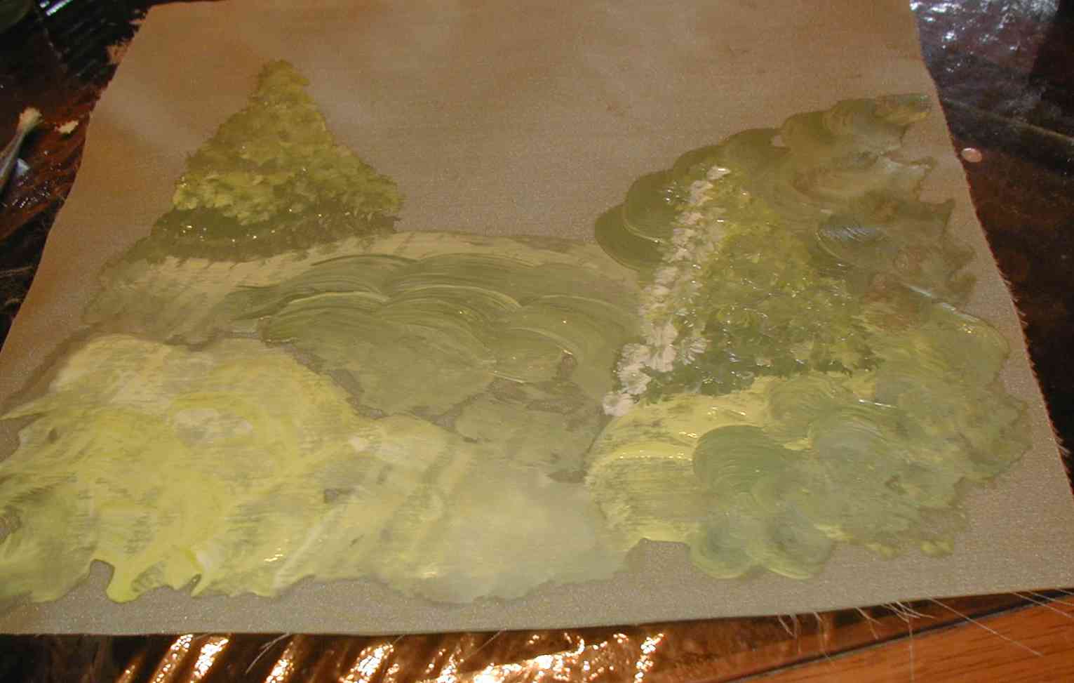
| These next two paintings use only the three stokes as above, just used a little differently. Here I'm actually creating something to resemble a background for a scene. I used the same palette as above, just added some light green and dark green | 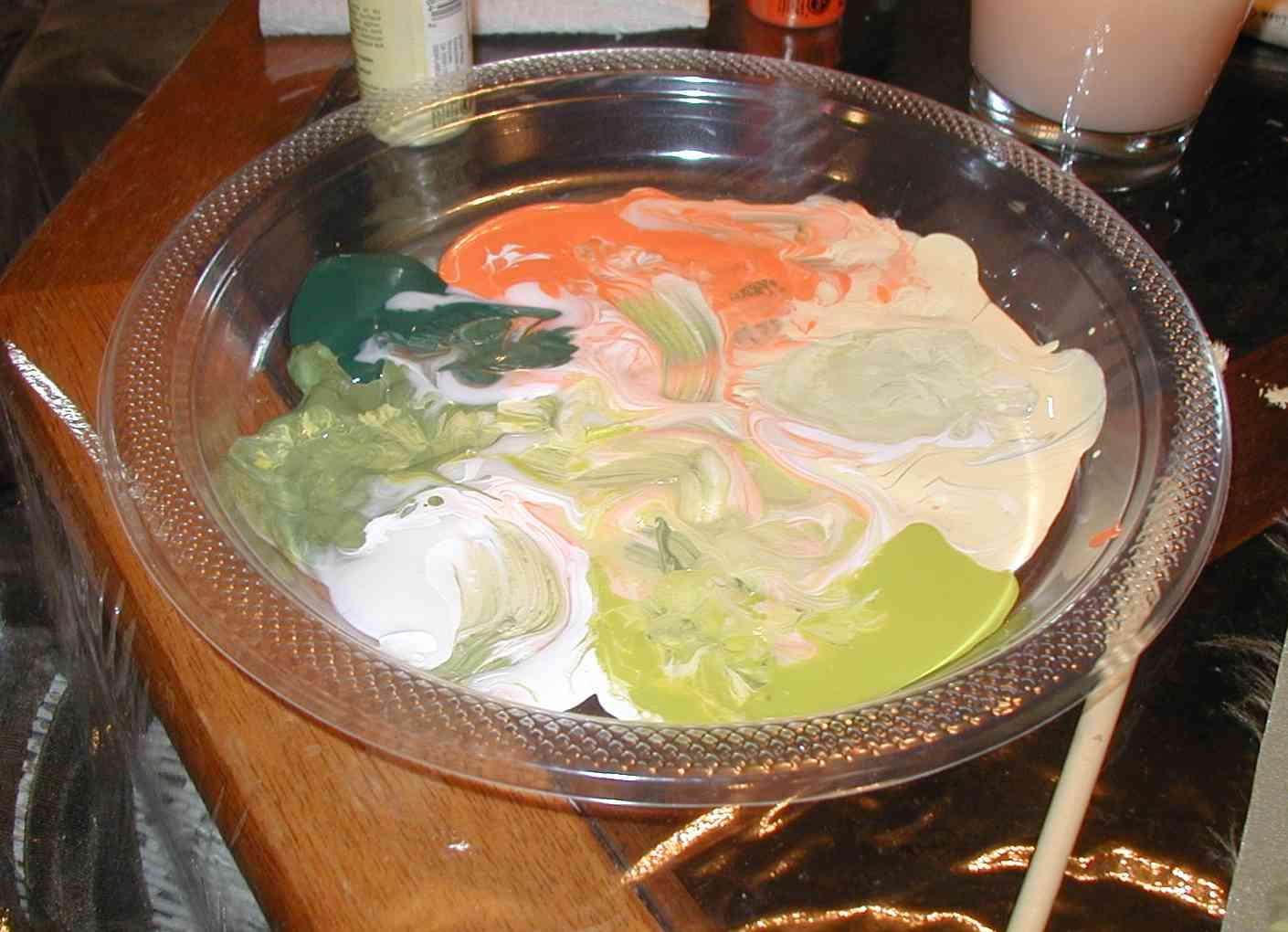 |
|
| First I use some half circles strokes to create the lower section (might be hills, foliage, ?? - not sure yet) | 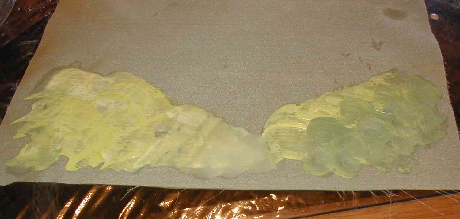 |
|
|
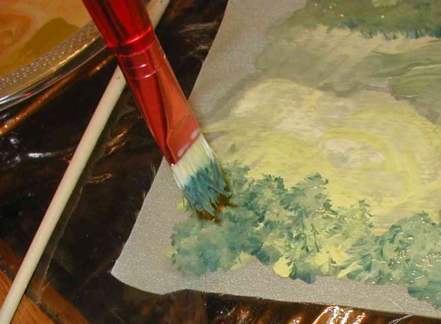
To add some highlight, I added yellow to my brush and put a row
of short quick dabs along the left hand side of my *tree* I made
another tree in the background. Those half circles and strokes are
starting to look more like rolling hills :) |
 |
|
|
To add the look of some foliage at the lower right corner, I loaded my brush mostly with the dark green and dabbed across the bottom |
 |
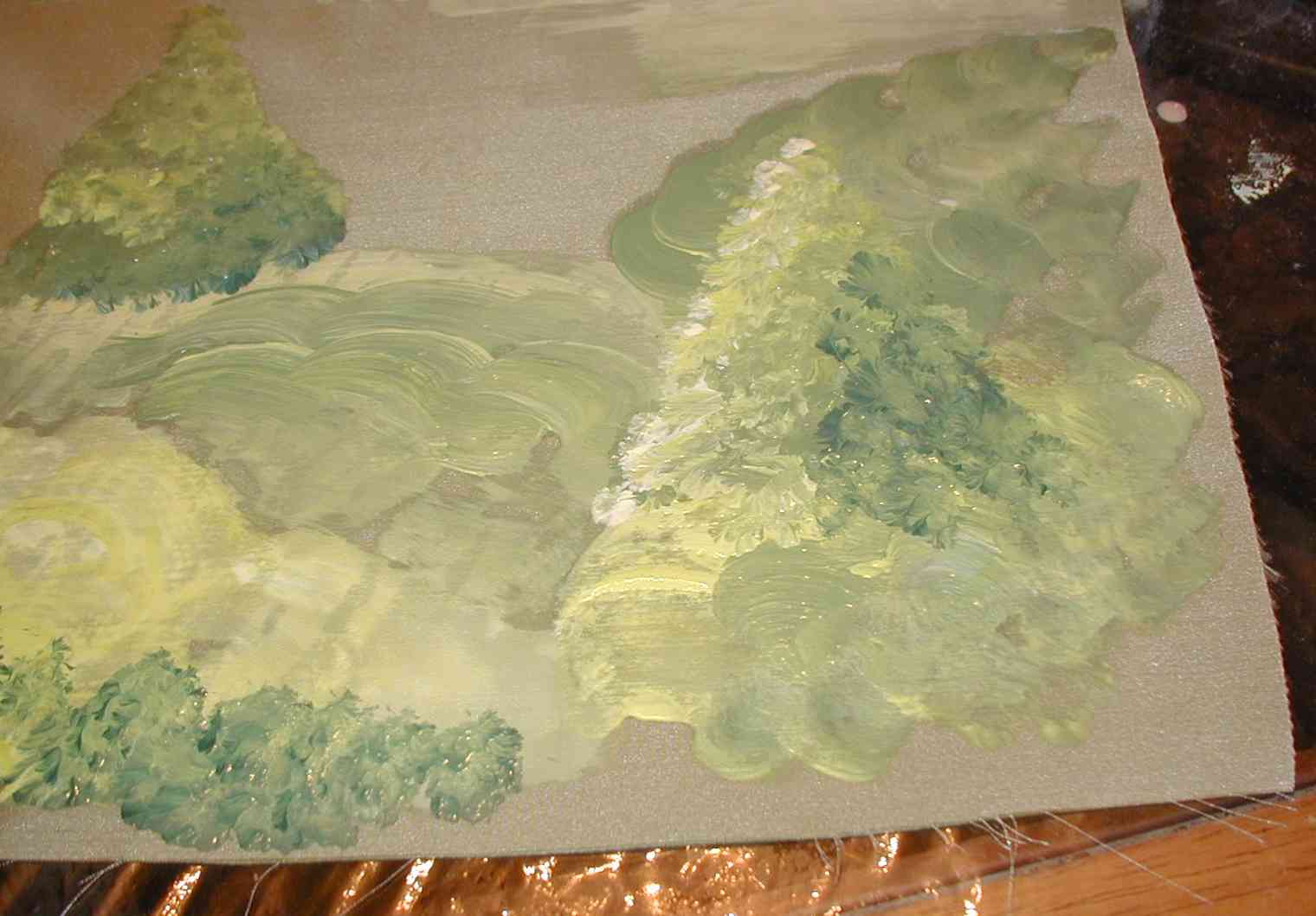 |
| To add some *ground* looking sections I mixed some of the dark green and orange that I still had on my palette from the first painting and used some strokes and half circles to create a path, another hill? The beauty of this kind of painting is that it doesn't have to be realistic - you are giving the *hint* of something, not actually painting a picture of a particular thing | 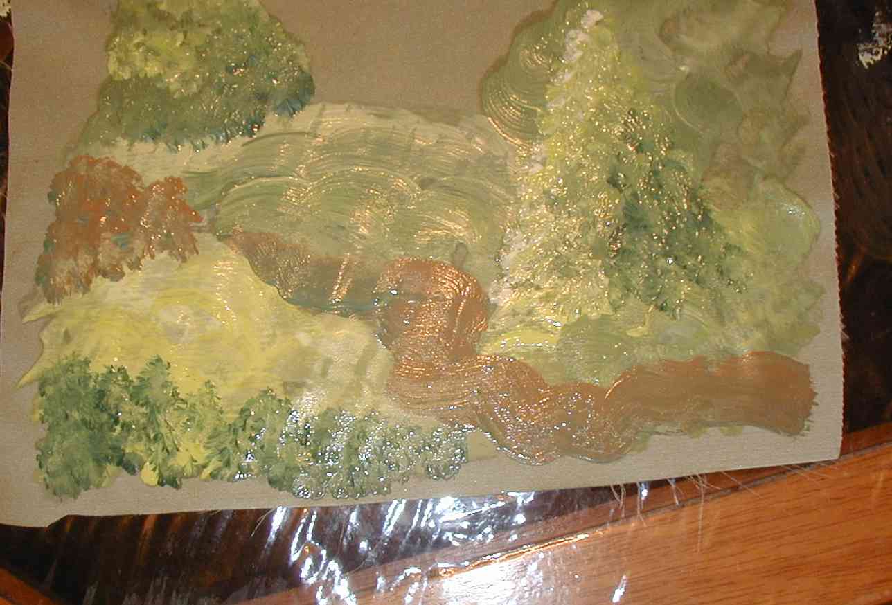 |
|
|
To finish off the top, I mixed a lot of white, light green and yellow and made long strokes across the top left side. I left the middle section without paint. This was done on a piece of pale green taffeta This would look great with some animals or a couple of fairies embroidered on it |
 |
|
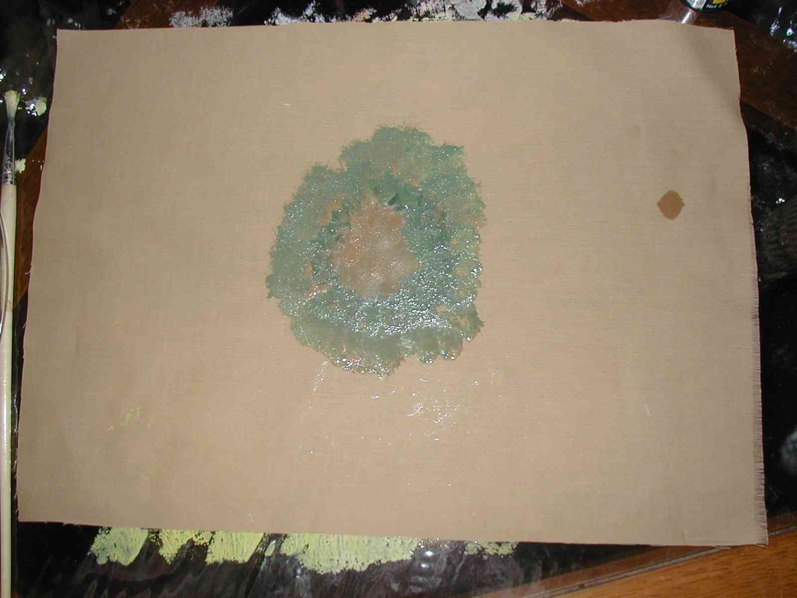
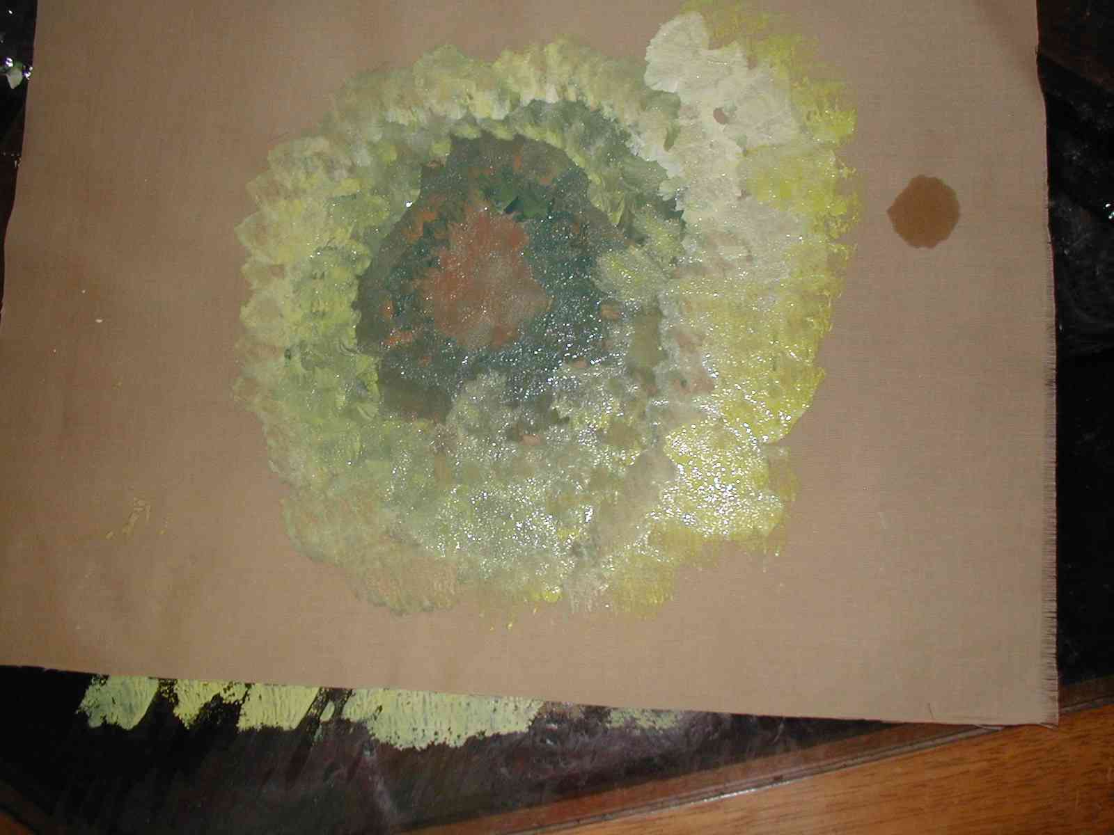
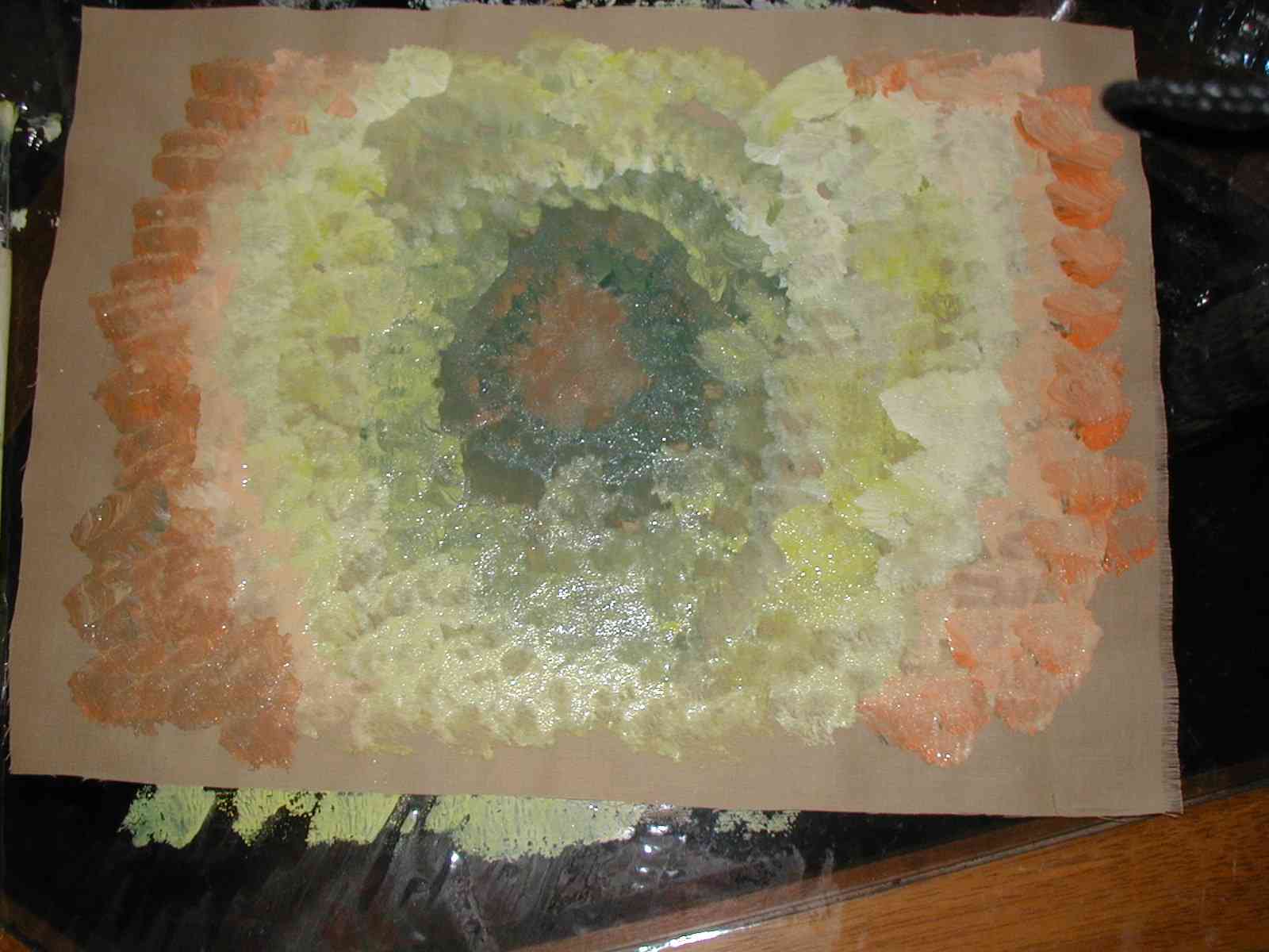
| Well, I've done two paintings and I still have a palette full of paint. Hating to throw anything away, below is an easy way to use up the remainder of your paint. This is done completely using dabs and starting in the middle and working outward. | ||
Example Three |
||
|
|
||
 |
 |
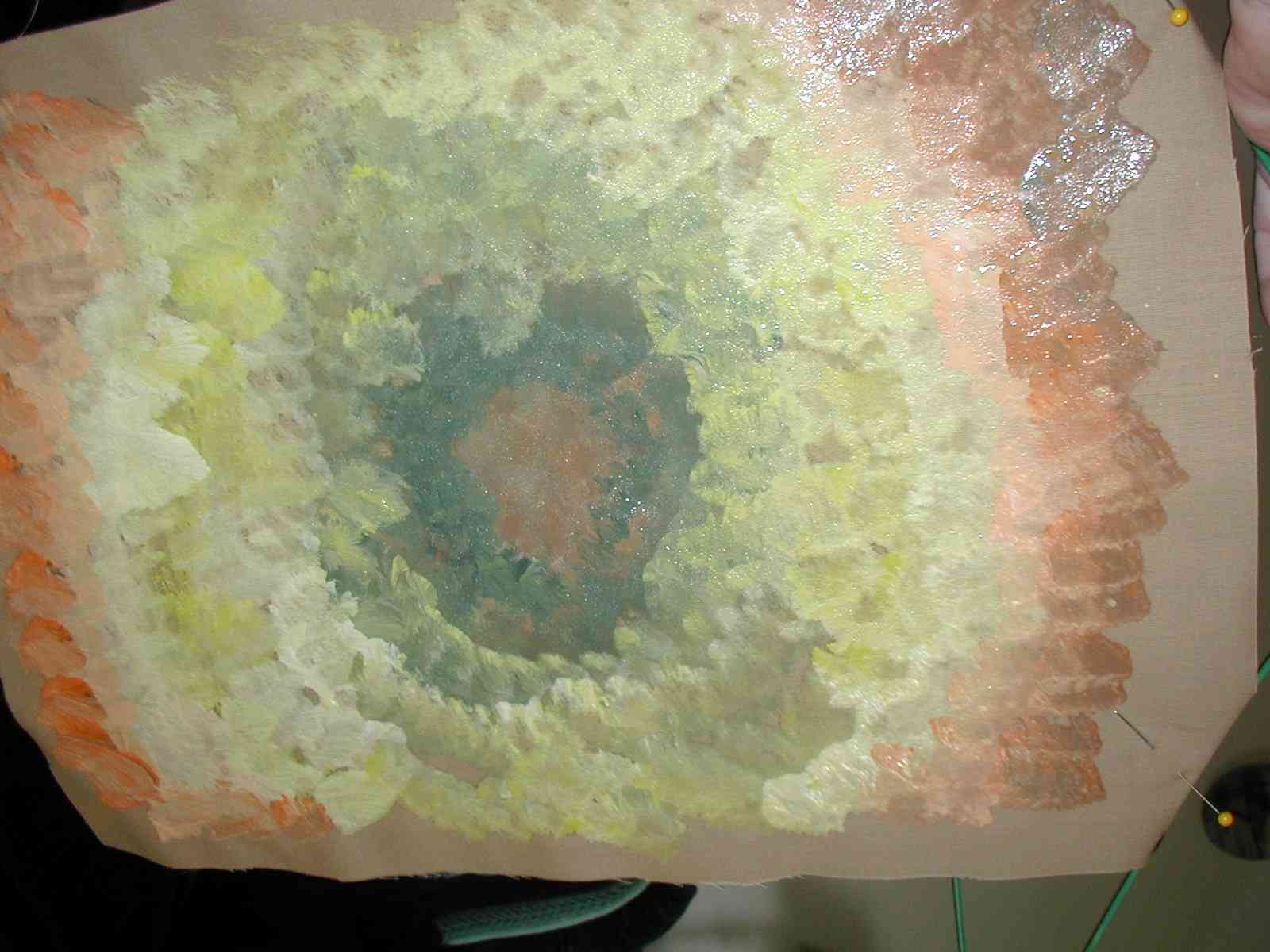 |
Belle Sirena might look good in the middle of this one |
||
| I would like to put pictures of your work here for everyone to see. Please email pics to suz@bfc-creations.com | ||
|
|
||